Inter­disciplinary practices in
information design & visualization
in Potsdam, Germany
19–21 Oct 18

Information+

conference 2018

Following the success of Information+ 2016   in Vancouver, Canada, the biennial conference brings together researchers and practitioners in information design and visualization to discuss common questions and challenges in these rapidly changing fields. Unlike discipline-specific gatherings, Information+ seeks to foster productive exchanges amongst the variety of people involved in the theories, practices, and pedagogies of analyzing and communicating information.

Information+ 2018 again included three events: a workshop day [19 Oct], a two-day conference [20–21 Oct], and an exhibition of historic information design [19 Oct – 14 Dec]. The events took place at the University of Applied Sciences Potsdam (FH Potsdam), which was the first university to offer a study program in interface design in Germany. It has since gained international reputation for their design-oriented information visualization research.

Information+ 2018 was co-located with IEEE VIS 2018, [21–26 Oct] in Berlin. The conferences were separate events, requiring separate registration. By co-locating these events, we encouraged cross-disciplinary discourse, especially with regards to exchanges between the science and design ‘camps’ of the visualization community.

Information+

Keynotes

Reuben Fischer-Baum & Chiqui Esteban

Reuben Fischer-Baum is an Assignment Editor on the Washington Post graphics team, focused on politics and sports. Chiqui Esteban is the Post's Graphics Director. This award-winning team builds visually-driven stories for an ever-expanding number of platforms, experimenting with new storytelling techniques to help readers make sense of the news. Reuben previously worked at FiveThirtyEight and Gawker Media. Chiqui previously worked at National Geographic, The Boston Globe, La Voz de Galicia, Diario de Cadiz, Publico and lainformacion.com.
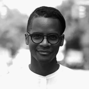
Ron Morrison

Ron Morrison is a designer, artist, and researcher working across the fields of human geography, digital technology, and urbanism. They investigate how the unassimilable complicates race and geographic space as fixed and knowable. From building open source platforms to upend solitary confinement to crafting community based archives to combat gentrification, their work explores cartographies of slow violence, cybernetics, and blackness. Their work was implemented in the US, Ghana, Colombia, Ethiopia, Italy and featured at AIA New York, UN World Urban Forum, and Tribeca Film Festival. They are currently an Annenberg PhD fellow at the University of Southern California in Los Angeles.
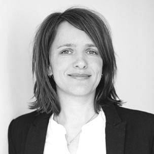
Sandra Rendgen

Sandra Rendgen is an independent author and researcher with a particular focus on data visualization, interactive media and the history of infographics. Her academic background is in art history and cultural theory. In collaboration with Taschen Publishing, she released “Information Graphics” (2012) and “Understanding the World” (2014). Currently she is working on two new books about the history of data visualization and information graphics.


Fernanda Viégas & Martin Wattenberg

Fernanda Viégas and Martin Wattenberg co-lead Google’s PAIR (People+AI Research) initiative, part of Google Brain. Their work in machine learning focuses on transparency and interpretability, as part of a broad agenda to improve human/AI interaction. They are well known for their contributions to social and collaborative visualization, and the systems they’ve created are used daily by millions of people. Their visualization-based artwork has been exhibited worldwide, and is part of the permanent collection of Museum of Modern Art in New York.

Information+

Schedule
Saturday, 20 Oct
08:00 am
Breakfast & Registration
09:00 am
Welcome
09:15 am
Sandra Rendgen
Inventing the future, one visualization at a time
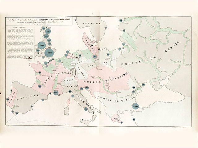
Information visualization is a young and buzzy field. Much of its creativity and research is aimed at mastering new technologies, and at supporting human-machine interactions of the future. Yet in many current professional and academic debates, there’s a near total lack of historical perspective. With everyone looking forward, there’s no point in looking back. Or is there? Thousands of examples open up a long and evocative history of information visualization. So, just what do these Old Masters have to offer today’s visualization designers and researchers? When looking to invent the future, is there anything to be learned from the past? The talk will draw from an abundance of material including classics like Charles-Joseph Minard and Joseph Priestley, but also many unknown precursors, to demonstrate how a knowledge of history helps to develop a critical and sophisticated understanding of the practice of information visualization.
Sandra Rendgen, independent author and researcher, DE
10:00 am
Claudia Rebeca Méndez Escarza
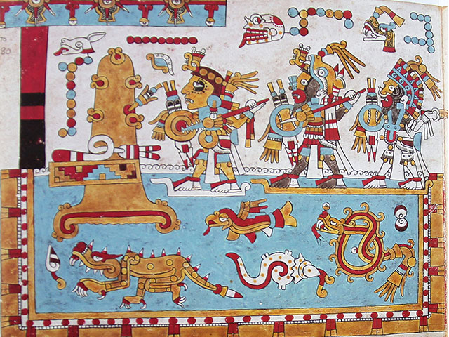
Mixtec pictorial manuscripts: A source of visual information
Mexican Pre-Columbian civilizations have written their history using painted language. Some of these manuscripts were painted in Oaxaca where Mixtecs have lived among other pre-Columbian civilizations. Their manuscripts portray information concerning history, location, time, and financial issues.

These manuscripts have not yet been considered as informative documents; therefore a detailed study is necessary in order to expose the main traits of informational signs and its structure. The main purpose of this paper is to unveil pictorial signs, which convey information, found in historical Mixtec manuscripts. The research will lead to a full understanding of the informational characteristics that those signs contain. It will be done by analyzing a pair of Mixtec painted manuscripts. One that has been painted during Pre-Columbian times (XIV century) and the other circa the second half of the XV century.

This paper is part of the initial phase of a doctoral degree dissertation concerning information design and visualization.
Claudia Rebeca Méndez Escarza, Universidad Popular Autónoma del Estado de Puebla, MX
10:20 am
Günther Schreder + Eva Mayr
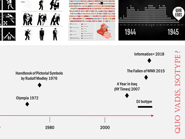
Quo vadis, Isotype?
About 100 years ago, Otto Neurath developed the International System of Typographic Picture Education (ISOTYPE) to visualize statistical data, support education, and communicate social and economic facts and processes in an intuitive way. While Neurath’s ideas inspired InfoVis and are well known among designers, little is known about effects on recipients and Isotype has not been systematically applied in InfoVis. The first part of our presentation addresses the cognitive effects of pictorial statistics. The second part will explore future extensions of Isotype into contemporary InfoVis by leveraging animation, storytelling, and interactivity to not only communicate facts, but also support active reception and reflective thinking.

In our talk, we discuss which types of diagrams and visualizations, aside from bar charts and maps, would be suitable for (partial) isotypization. What would storytelling with ISOTYPE look like (film, data documentaries)? Is it possible to take Neurath’s ideas to the 21st century?
Günther Schreder and Eva Mayr, Danube University Krems, AT
Günther Schreder, Florian Windhager, Nicole Hynek, Georg Neubauer, Florian Halm and Eva Mayr
10:40 am
Break
11:20 am
Sam Holleran
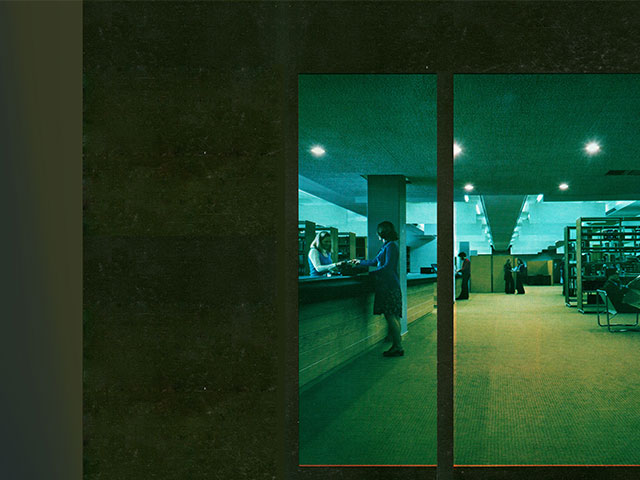
A History of “visual literacy” campaigns
This presentation traces the history of “visual literacy” campaigns and the application of the term to a wide variety of programs within design education and the social sciences. It examines educator-created tools that aim to teach students to prune away excess visual information, as well as the position of the viewer in a world increasingly saturated with pictures.

The presentation will chart several major campaigns from the U.S.—sponsored by libraries, major universities, and NGOs —that sought to define and improve visual literacy beginning in the 1970s. These public interest initiatives shifted the notion of “literacy” from the mass literacy campaigns of the 1960s, to the arena of the visual in the 1970s. In the push for the public to become savvy “knowers” of images, we see a change in the way graphic media is created and visual space is perceived.
Sam Holleran, AIGA NY, New York, US
11:40 am
Will Stahl-Timmins
The BMJ visual abstracts
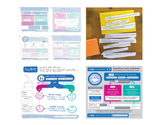
To help time-pressured readers of The British Medical to quickly understand key messages of clinical trials that we publish, we have begun creating visual abstracts. They offer a quick overview of the key points of a paper, and are used on our website, print journal, and social media channels.

We conducted formative user evaluations to help us determine which information to include. Summative evaluation post-publication has been encouraging. However, it remains to be seen whether this is a sustained pattern, or a halo effect because of the novelty of the visual abstracts. We are cautiously optimistic about the effects of introducing visual abstracts in the journal. We believe that we have managed to strike a balance between the twin evils of information overload and oversimplification of nuanced messages.
Will Stahl-Timmins, The BMJ, GB
12:00 pm
Guillermina Noël + Jorge Frascara
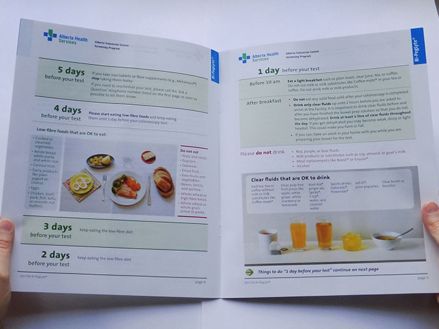
Designing an optimal document in the health sector
Medical personnel usually write and design documents that inform physicians or patients about procedures or therapies. Document design, however, requires skills that are not normally applied, resulting in information that is often not used properly.

The Alberta Colorectal Cancer Screening Program commissioned us to re-design existing instructional documents. We reviewed them, developed performance specifications for their re-design, and used an iterative process of prototypes and testing, also resorting to literature on reading comprehension, memorization and use of information, involving plain language, visual perception, page layout, legibility, editorial consistency and use of images.

To redesign the document we identified 23 principles based on peer-reviewed research. We tested each iteration with users to ensure ease of use, completeness of information, accuracy and clarity, to facilitate adoption.

The document has been downloaded 26,000 times, suggesting a good physician reception. An evaluation of the impact on use of the information by patients is underway.
Guillermina Noel and Jorge Frascara, University of Alberta, Edmonton, CA
Guillermina Noel, Jorge Frascara and Clarence Wong
12:25 pm
Sol Kawage
Adventures in colour coding
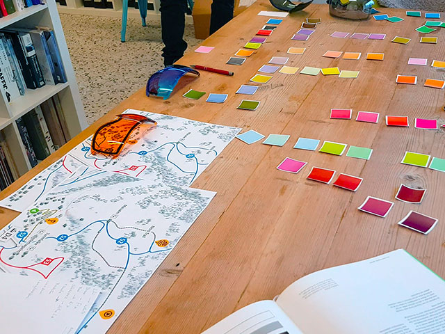
At the end of 2017 we won an international design competition to design the wayfinding system for the Skicircus Saalbach Hintgerglemm Leogang Fieberbrunn, one of the largest ski areas in Austria. A key factor in the project is how to facilitate speed and accuracy in transmitting essential information. Our starting point was the logic of highways, which led us to create a radically reduced standard. These two factors influenced our research and practice into colour coding in skiing areas.

Colour is an essential tool for us environmental graphic designers and our decisions have a huge impact on the overall system, but there are limitations by way of numerous legal requirements, cultural habits and environmental conditions which restrict the choices.

In this talk we will show how we faced the challenges posed by these limitations, and how we came up with the colour coding for the different variables that required it, taking into account simplicity, contrast and nameability.
Sol Kawage, Motasdesign, AT
Sol Kawage, Christian Lunger and Markus Scheiber
12:30 pm
Adina Renner
Connecting people through visualization. Creating a data-driven visual identity that encourages meaningful interactions
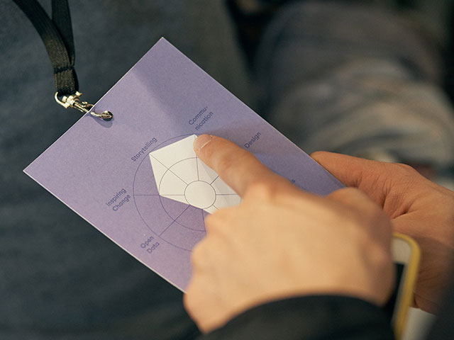
A fundamental challenge when organizing a conference is how to facilitate the development of purposeful connections, both between and among the audience, the speakers, and their topics. Rather than assigning a specific time and place for people to interact, Visualizing Knowledge Conference 2018 devised a system that encouraged connections through the features of the conference’s identity. Applying User-Centered Design methods, the team developed two visual elements that stimulated the formation of connections: a data-driven shape that revealed each participant’s interest in core aspects of the information design process, and a wordmark that could be extended with the topics addressed at the conference. These nonintrusive elements allowed for an individual pace to human interactions in a large gathering of people.

The lightning talk will give an overview of the design process, discuss learnings and elaborate on the potential of our approach.
Adina Renner, Aalto University, Helsinki, FI
Rupesh Vyas, Adina Renner, Alessandra Del Nero, Heini Kekki, Lilla Tóth, Pei-Yu Lin, Qin Yang, Minna Ainoa
12:35 pm
Jessica Bellamy
Access to information design: A design tool for the people
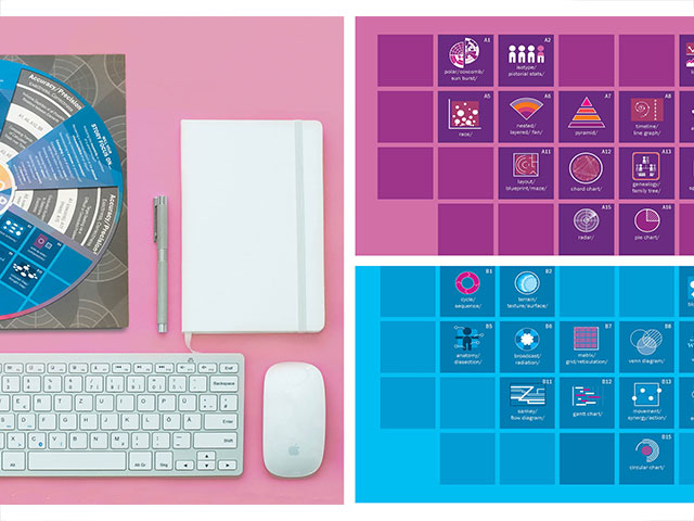
Not all professionals who work with data have the creative skills necessary to create an easy to interpret, effective visualization strategy. Most professionals have a data design repository that is limited to traditional and overused graphics such as pie charts, bar graphs, area charts, etc. But what if there was a design tool that could help expand their visual vocabulary? As an infographic designer and information design teacher, in 2017, I created the Infographic Wheel. The Infographic Wheel is a handheld design tool that helps people select a visual layout based on the characteristics of their dataset. This tool makes information design more accessible for the average person. As more people gain the ability to communicate complex topics in inventive ways, we both amplify new ideas and increase our opportunities as a visual global society to communicate more efficiently with each other.
Jessica Bellamy, GRIDS: The Grassroots Information Design Studio, US
12:45 pm
Lunch
02:05 pm
Olivia Vane + Stephen Boyd Davis
Designers — what are they good for (in data visualisation)?
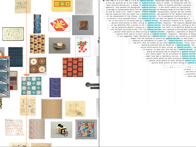
Our focus is the digital humanities, especially visualisation of datasets such as text archives and object collections data in museums. The name “digital humanities” implies just two disciplines, computing and the humanities. What is the designer’s role? Collectively we should be able to explain what our contribution is —especially when some may fear our replacement by AI systems. We argue that there are particular aspects of designing that are distinctive and can enable more effective visualisations to be produced: (1) expertise in the visual articulation of meaning, (2) human-centric methods, and (3) the quick and adaptable use of low-fidelity early prototyping. We base our argument especially on the idea of design as a form of inquiry or research, and illustrate the three benefits using our recent interactive data visualisations with organisations including the Wellcome Library, Cooper Hewitt Smithsonian Design Museum and V&A London.
Stephen Boyd Davis and Olivia Vane, Royal College of Art, London, GB
02:25 pm
Sarah Campbell
Feeling numbers: The emotional impact of proximity techniques in visualization
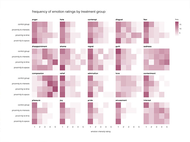
Data visualizations are used as rhetorical instruments, but how they persuade has yet to be fully understood. In scholarly critique, persuasion in visualizations has been negatively related to concepts like bias and deception. However, when considering visualization as a form of communication, persuasion is a natural and critical part of conveying a message. Of Aristotle’s three modes of persuasion, the appeal to emotions has been the most overlooked in rhetoric research of information visualization. We present empirical research which validates the ability of visualizations to appeal to emotions through proximity techniques. The findings indicate that the framing of data matters, that people feel greater interest towards a topic when the visualized data are more relevant to them, and that data representing events closer in time are more affecting. This research takes a step towards improving our understanding on the use and impact of techniques that appeal to emotions in visualization.
Sarah Campbell, Northeastern University, Boston, US
Sarah Campbell and Dietmar Offenhuber
02:45 pm
Doris Kosminsky + Jagoda Walny
Belief at first sight: Data visualization and the rationalization of seeing
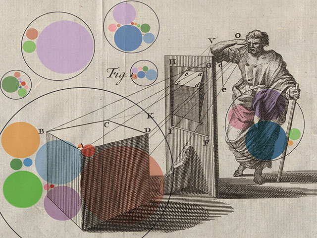
Data visualization has been increasingly represented in public discourse as an objective proof of facts. However, visualization is only a single translation of reality. It is crucial that we consider why data visualization has been primarily thought of as truth, irrespective of the origin of the data, its processing, the choices made by designers, developers and clients, or its display context. We reflect theoretically on data visualization as a system of representation historically anchored in science and rationalism. It establishes itself within a lineage of conventions for visual representation grounded in objectivity and rationality, which extends from the Renaissance perspective to the present passing through the photographic image, movies, TV, and finally computer graphics. By starting a discussion about the tendency to see a “natural” credibility in data visualization rooted in its historical context, we might broaden our approach to presenting data visualizations in the public discourse.
Doris Kosminsky, Universidade Federal do Rio de Janeiro, BR Jagoda Walny, University of Calgary, CA
Doris Kosminsky, Jagoda Walny, Søren Knudsen, Jo Vermeulen, Wesley Willet and Sheelagh Carpendale
03:10 pm
Sibylle Schlaich + Anita Meier
Public pictograms: Pointing out trends for the future
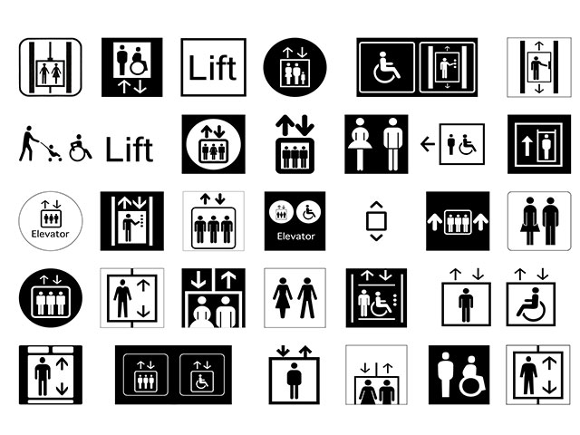
In this presentation, we give a brief summary of a study to draw the attention to the challenging perception of the two public information pictograms: “elevator” and “toilet”. In wayfinding and on signage, both indicate the location of a destination. Although the semantic information is completely different, both pictograms partly visualize the same: Front view of standing human figures. On signs and in certain contexts this can lead to confusion.

The representation of human figures is increasingly being questioned on the basis of public and political discussions on gender issues. Moreover, attention to accessibility is also strongly incorporated in these two pictograms. Thus, both pictograms are in an evolution process in order to meet current requirements. Do more messages require a more complex pictogram? How far can we go?

We envision that this study will raise awareness of the handling of these pictograms and point out trends for future visualization.
Sibylle Schlaich and Anita Meier, Moniteurs GmbH, DE
03:15 pm
Valentina D’Efilippo
Mapping the world from memory
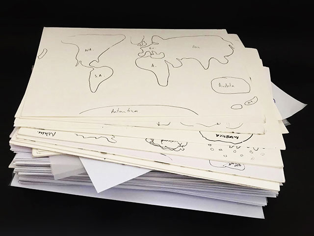
A large collection of hundreds of hand-drawn maps provides a fascinating array of geospatial recall and artistic skill. And, more importantly, leads to compelling observations on how we create, read, and interpret visual displays of information. During this short format talk, I will share my observations from hundreds of hand-drawn maps and my experience in using cognitive maps as a tool to rapid prototype visual displays of information – focusing on the subjectivity that goes into both the encoding and decoding process. In fact, internal maps influence the way we not only read but also create maps through framing, coding, and designing during conception and execution
Valentina D’Efilippo, Signal Noise - The Economist Group, GB
03:20 pm
Nadieh Bremer
The creation of the “Bussed Out: How America moves its homeless” article
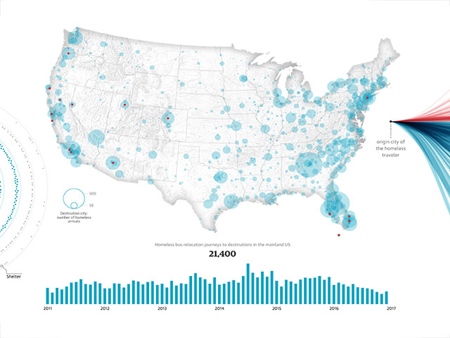
Each year, US cities give thousands of homeless people one-way bus tickets out of town. An 18-month nationwide investigation by The Guardian reveals what really happens at journey’s end. From looking at the big picture of the more than 34,000 journeys that were gathered, down to the individual. This article combines text, animated data visualizations, photography & videos to create one compelling piece to show the readers the impact of the journeys taken. I was one of the main people responsible for getting this story told and during the talk I will take you through a few of the major points of the design process behind the piece. How I & Shirley Wu joined the project and dove into 4 hectic months of data cleaning, analysis, designing, prototyping and finally putting everything together into one page that had to look good on practically any digital device with a screen.
Nadieh Bremer, Visual Cinnamon, NL
03:30 pm
Break
04:10 pm
Grga Basic
We Can: Data driven project exploring the lives of NYC canners
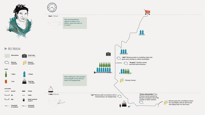
Canning —picking up cans and bottles on the streets for a living— has been an increasingly popular activity in New York City for over 30 years, becoming an indirect welfare system created and sustained by redeeming garbage, worth 5 cents apiece. Over the past year, journalist Francesca Berardi followed a group of canners in their daily activity, collecting qualitative and quantitative information about their work. They come in the forms of handwritten notes, sketches, oral history interviews, photos, videos, and GPS tracks of their itineraries. We Can combines the aforementioned media into an interactive and immersive web experience. As the stories of canners unfold across mental maps of the city that take shape through illustration, analogue data visualization, and oral history, we push for new and experimental forms of urban storytelling that explores a more co-owned narrative through pairing geospatial data with the extraordinary nuances of human lives and experiences.
Grga Basic, Columbia University Center for Spatial Research, New York, US Francesca Berardi, Columbia University Brown Institute for Media Innovation, New York, US
04:30 pm
Kennedy Elliott
Think like a journalist: Tips for stronger, clearer and more cohesive visual narratives
I’ve learned that after more than ten years working in news, the lessons I’ve learned as a journalist are infinitely applicable to every field. Implementing the tools, techniques and perspectives of a journalist makes a story more cohesive and more comprehensible to an audience. At the center of this philosophy is to simply understand readers and to anticipate their needs.

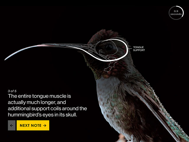
As journalists, our job is to understand what information readers would value the most and communicate with them appropriately. At National Geographic, we regularly must make esoteric information more comprehensible to a non-expert, but enthusiastic audience.

In this session, I’ll talk about some of the skills I’ve learned as a journalist. I’ll show some of my favorite science graphics from National Geographic and talk about the path we took to produce the visual story. I’ll review how to report and visualize your data for stronger, clearer and more cohesive narratives.
Kennedy Elliott, National Geographic, US
04:55 pm
Reuben Fischer-Baum
+ Chiqui Esteban
Working in a graphics visual storytelling team
The Washington Post graphics team has moved on from the classical role of graphics departments to become a one-stop shop for visual narrative content. The role of this group is not only focused on creating graphics and visualizations as isolated items, but to develop complete stories that use visual content as the main vehicle to transmit information. That doesn’t mean forgetting the value of the text, the power of other visual formats like video, illustration or photo, the advantages of an attractive design, the eventual bells and whistles or even the little charts and locators that make the day-to-day of a newsroom. Narrative structure, constant edition, rigor, but also originality, boldness and fun are the pillars of, not a collection of individuals, but a team created with diversity of skills and backgrounds in mind: cartographers, engineers, writers, data reporters, designers, graphics artists … but journalists first.
Reuben Fischer-Baum & Chiqui Esteban, The Washington Post, Washington DC, US
06:00 pm
Dialog dinner
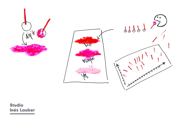
We are closing the first day of the conference with our Dialog Dinner. The conference participants will be able to continue the topics and discussions of the day over great food and drink. We want to provide our guests with a data-driven culinary experience and encourage them to engage in larger discussions and individual conversations.
Boris Müller, Fachhochschule Potsdam
Studio Inés Lauber
Sunday, 21 Oct
08:00 am
Breakfast & Registration
09:30 am
Fernanda Viégas
+ Martin Wattenberg
Data visualization for machine learning
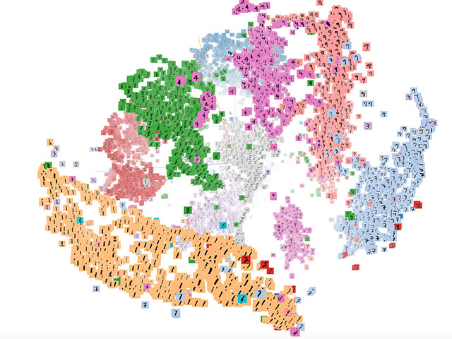
Machine learning is playing an increasingly influential role in the world due to dramatic technical leaps in recent years. But these new developments bring their own questions. How can we understand what is going on under the hood of deep neural networks? How can we better debug these systems? How can we broaden the conversation about ML-enabled automated decision making? It turns out that visualization can play a central role in answering these questions. We'll discuss recent work that shows how interactive exploration can help people use, interpret, and learn about machine intelligence.
Fernanda Viégas & Martin Wattenberg, Google’s PAIR (People+AI Research), Cambridge, MA, US
10:15 am
Christian Au + Christian Laesser
+ Stephan Thiel
Peakspotting — a visual tool for managing the capacity of Germany’s rail traffic network
The Peak Spotting software combines machine learning and visual analytics to help manage Germany’s rail traffic network. The project allows yield and capacity managers to identify potential bottlenecks based on passenger load predictions. It provides actionable information to several teams through data exploration and collaboration features, which contribute directly to improving planning and management.

In this talk, we present a design case study and share our lessons learned in enabling innovation in complex corporate settings. We will discuss the full design and development process of the tool from ideation, data and concept exploration over design and implementation to usage tracking and iterative refinement.

Of particular interest is the role of automation and analytics tools in digital transformation processes — how can we facilitate the transition from manual work and implicit knowledge to higher level tasks, supported by algorithms and visual analytics tools? And how does this change operational processes and job profiles?
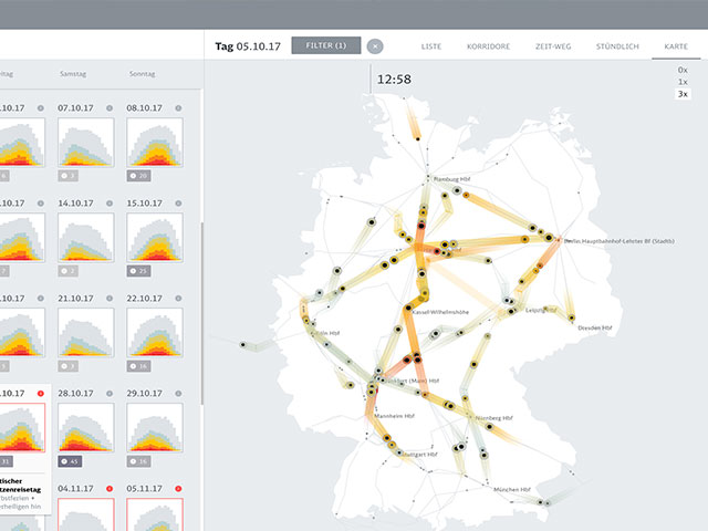
Christian Au, University of Applied Sciences Mainz, DE Christian Laesser and Moritz Stefaner, Truth & Beauty, DE Stephan Thiel, Studio NAND, DE
10:35 am
Raphael Reimann
Empathizing with AI: How to see like a self-driving car
“Who Wants to be a Self-Driving Car?” is a data driven trust exercise aiming to explore the technology behind self-driving cars from a human perspective. It uses real-time, three dimensional mapping and object recognition to help people navigate through space. This data is presented to the driver via a virtual reality headset, putting the driver into the position of the control unit of the vehicle.

The talk will be about the idea and intention behind the project, also giving insight into how the vehicle works. After gaining an overview of the technical setup, we will lay out and discuss design decisions and key takeaways from the experience of “seeing the world through the eyes of a self-driving car”. Finally we will talk about the experience we have gathered showcasing the experience to different audiences, along with approaches on formalizing the debate around humanizing technology in autonomous systems.
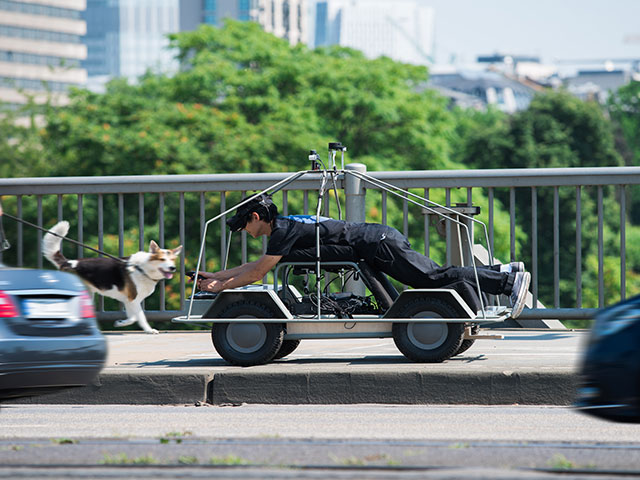
Raphael Reimann, Moovel Lab, DE
Raphael Reimann, Joey Lee and Benedikt Groß
10:55 am
Break
11:35 am
Jesse Josua Benjamin + Claudia Müller-Birn
Designing for algorithm awareness in peer production systems
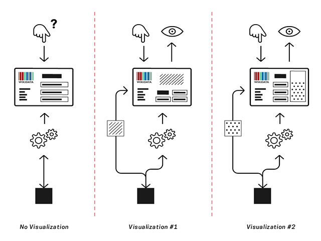
Algorithms increasingly impact human decision-making by stimulating, informing, controlling and reacting to human activities, thus, necessitating the need for algorithm explainability. In this project, we investigate the RECOIN (Relative Completeness Indicator) tool as a use case for algorithm awareness; a current topic delineating the extent to which a person is contextually aware of the existence and function of algorithms. RECOIN is a tool for Wikidata, a collaborative knowledge base that stores structured data and supports numerous Wikimedia projects. RECOIN aims to augment human decision-making on data contributions by measuring the relative completeness of data items and by recommending potential contributions. With concerns over encoded cultural bias, RECOIN reflects the complexities of co-evolving social and algorithmic governance mechanisms. Addressing these issues, we showcase three distinct visualisation designs of RECOIN through the lens of algorithm awareness and discuss experimental findings regarding their varying effects on human decision-making and understanding.
Jesse Josua Benjamin, Freie Universität Berlin, DE
Jesse Josua Benjamin, Claudia Müller-Birn and Simon Razniewski
11:55 am
Pedro M. Cruz
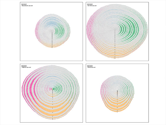
Simulated dendrochronology of immigrants and natural-borns in the United States, showing the fifty states (1790–2016)
Immigrants are central to the identity of the United States, the population of which has grown in number and diversity as a function of new arrivals from around the globe. In this communication, we go through the design process, the implementation, and the ongoing results of a visualization project leveraging arboreal visual metaphors to explore the contribution of immigrants to the country’s population. Immigrants and native-born persons are represented and differentiated as cells in trees, with layered annual rings capturing patterns of population growth. These rings register, in their shape and color, certain environmental conditions. In order to mimic the natural process by which growth rings are formed (the science of which is called dendrochronology), our project devises a computational system that generates tree rings as if cells were data-units.
Pedro M. Cruz, Northeastern University, Boston, US
Pedro M. Cruz, Avni Ghael, Stephen Costa, John Wihbey and Felipe Leonardo Santos Shibuya
12:15 pm
Richard Brath
Techniques for adding diverse contextual data into visualizations
Many current visualizations focus on a few data variables and simple representations for rapid visual perception. But many real-world problems require multi-variate decisions. While interactions can help explore contextual information —the context can only be uncovered if explicitly sought, meaning that it can be missed.

Instead, there are many historic visualization approaches which bring together heterogeneous data into high dimensional, data-dense plots, such as atlas maps, genealogical diagrams, detailed tables and railway timetables for analytical applications such as planning journeys, tracing relationships, extrapolating properties, and managing operations. A review of historic examples show contextual techniques, such as: shared coordinates to facilitate placement of data; enhanced multivariate marks such as icons or text; flexibility of layout and content to locate related information legibly; use of cues to facilitate macro and micro patterns; and use of differentiated markers that can be perceptually filtered to facilitate comparison across entities.
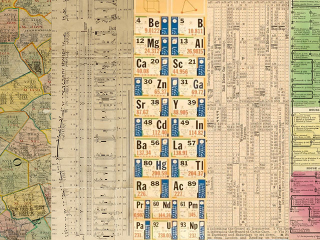
Richard Brath, Uncharted Software, Toronto, CA
12:35 pm
Lunch
01:55 pm
Yvette Shen
Visualizing philosophy: A modern design approach to understand I-Ching
This project uses text mining and interactive data visualization techniques to reveal new patterning insights of the ancient Chinese text I-Ching from both divinatory and philosophical perspectives. The implication of the hexagram patterns and their correlations with the commentaries are analyzed through text mining. The macro/micro visualization design strategy offers a comprehensive interactive experience to the viewers and sheds new light on this ancient book.

The goal of the project is to overcome cultural and language barriers, and investigate more innovative methods to objectively analyze and interpret I-Ching than language translations. The visualization approach and research process explore four aspects of I-Ching: the geometrical patterns of the Hexagrams, the semantics of the Hexagrams, the occurrences of keywords related to divination, and the thematic categories of the Decisions. Visualizing abstract text information that is polysemic and sometimes uncertain provides a new way to view and understand I-Ching and Chinese philosophy that can reach to a wide range of audiences.
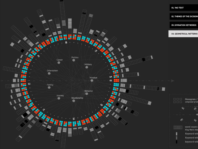
Yvette Shen, Ohio State University, Columbus, US
Yvette Shen, Peiyuan Tang and Han-Wei Shen
02:15 pm
Kelly Murdoch-Kitt + Denielle J. Emans
Participatory data visualizations support intercultural collaboration
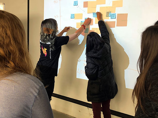
Although tools for working across distance and time are prevalent, inexpensive, and accessible to many, their existence does not guarantee successful intercultural work. Culturally attuned methods are the missing ingredient to bring design teams together across geographic and social borders. Participatory information visualizations —created by students or professional design practitioners involved in intercultural collaborations— can contribute significantly to a shared sense of community. The authors’ ongoing research has produced several participatory visualization methods; one recent method that holds great promise is the High-Low Context Matrix. Created in real time through a combination of physical and digital tools, this matrix shows how each participant maps along the cultural continuums developed by anthropologist Edward T. Hall, and helps participants envision each other as a collaborative community. The information visualization results in energized discussion among cross-cultural teammates —they begin to investigate culturally determined attitudes and linguistic patterns that shape communication, personality dynamics, and educational goals.
Kelly Murdoch-Kitt, University of Michigan, US Denielle J. Emans, Virginia Commonwealth University in Qatar, QA
02:35 pm
Anne Luther
Qualitative data visualization: The Entity Mapper
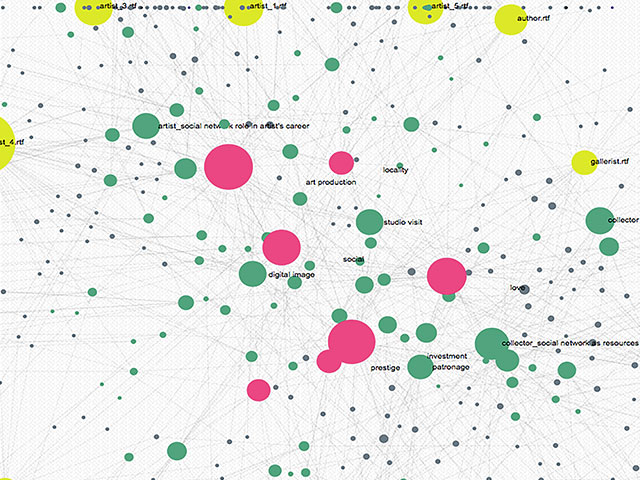
This paper introduces how we can develop data visualization in qualitative research with an example of a software that was developed by Dr. Anne Luther and her team at the Parsons Institute for Information Mapping at The New School in New York, today’s Center for Data Arts. The Entity Mapper is a data visualization tool that makes data visually accessible without losing the complex and manual character of qualitative analysis. Many of the methods used to access, understand, and analyze qualitative data are based on relational links between unstructured data, and abstracted concepts researchers develop. Understanding how node-and-link visualizations might be helpful for mapping relational data, the Entity Mapper visualizes semiconstrained relational networks using qualitative data exported from Atlas.ti. The Entity Mapper is an open source project published on GitHUB.
Anne Luther, Center for Data Arts, The New School, New York, US
03:00 pm
Theodor Hillmann
Modal
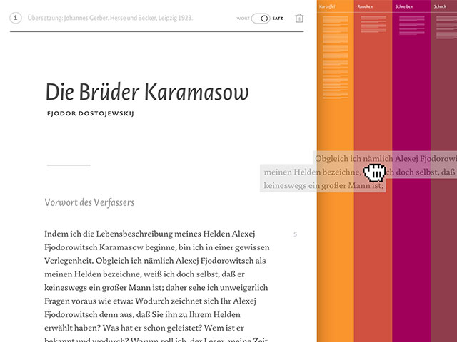
Modal is a research tool for annotating complex structures in texts. It enables users to develop multiple perspectives on texts by allowing them to annotate and categorise passages into self-defined structures. Based on insights gained in collaborative workshops with literary scholars and students, Modal introduces a way to analyse text fragments isolated from their original context in different columns assigned by the user. With this comprehensive analysis, users gain a superior understanding of texts during research.

The user interface provides multiple visualisation perspectives: a distant view of all annotations, a classic close reading and several cut-up views comprised of the individual passages and their distributions within the document. The interaction concept strives for a rich user experience with an elaborate typographical use and a tested intuitive user flow.
Theodor Hillmann, FH Potsdam, DE
Julian Thiel, Theodor Hillmann, Joshua Pacheco, Fabian Wohlfart, Jan-Erik Stange
03:05 pm
Fritz Lekschas
Visually exploring the genome at scale
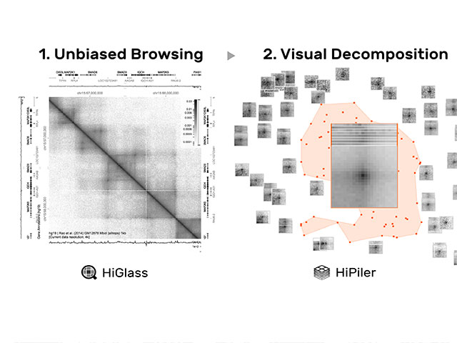
The human genome is about 2 meters long and tightly folded into the cell nucleus, a sphere that is 4 million times smaller than a pinhead. How do cells avoid entangling the DNA and ensure accessibility of necessary parts? Biologists study DNA folding through the detection of pairwise physical interactions along the DNA, which results in a 3-by-3 million pixel matrix. Visualized as a heatmap, thousands of local visual patterns become apparent. Yet studying these patterns is like trying to understand the average layout of parks while viewing countries on a world map. Biologists need to inspect these patterns for sensemaking of biological features. We have developed 3 interactive tools to explore such large datasets at different steps: (1) seamless browsing using HiGlass; (2) local pattern exploration through decomposition in HiPiler; and (3) guided navigation with Scalable Insets. I will present our tools and discuss the generalizability of their underlying concepts.
Fritz Lekschas, Harvard University, Cambridge, MA, US
Fritz Lekschas, Benjamin Bach, Peter Kerpedjiev, Michael Behrisch, Nils Gehlenborg and Hanspeter Pfister
03:10 pm
Alec Barrett
Mechanical inspiration for digital design: Lessons from the split‑flap board
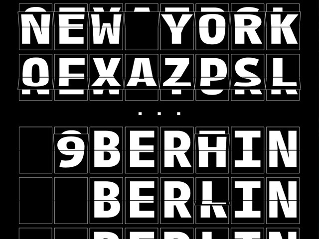
What lessons can the mechanical split-flap board, a.k.a. the Solari board, offer for digital information design? Solari boards were ubiquitous for decades in train stations and airports around the world. Their distinctive combination of motion and sound made them so popular that many modern transport hubs now feature digital versions with the same structure and constraints as the originals. In this talk I will analyze the Solari board’s visual design in the context of design theory and in comparison with other familiar displays, including stock market ticker tapes and stadium scoreboards. I will argue that creators of data visualizations can learn from three aspects of the Solari board’s transitions: prolonged sensory stimuli, which draw the viewer’s attention; a simple algorithm by which the board changes states; and the board’s economy of space, which is made possible by the middle split and its use of depth.
Alec Barrett, TWO-N, New York, US
03:20 pm
Break
04:00 pm
Catherine D'Ignazio
Data feminism
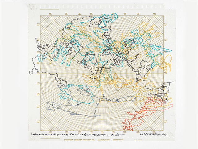
Data visualizations can dazzle, inform, and persuade. It is precisely this power that makes it worth asking: "Visualization by whom? For whom? In whose interest? Informed by whose values?" These are some of the questions that emerge from what we call data feminism, a way of thinking about data and its visualization that is informed by the past several decades of intersectional feminist activism and thinking.

Using visualization as a starting point, this paper works backwards through the data-processing pipeline in order to show how a feminist approach to thinking about data not only exposes how power and privilege presently operate in data science, but also suggests how different design principles can help to expose inequality, mitigate bias, and work towards justice. In the process, we discuss the talented journalists, artists, data scientists and communities that are at the forefront of data-driven justice.
Catherine D'Ignazio, Emerson College/MIT, Boston, US
Catherine D'Ignazio and Lauren Klein
04:20 pm
Greg McInerny
Lost in the universe of graphical objects? Critical visualisation, disciplinary myopias and the visualisation spectrum
When do graphs become visualisations? What do visualisations visualise? This talk investigates how we ask these questions through the “Universe of Graphical Objects” (UGO); a hyper-volume containing the infinite possible variations and permutations of graphical objects from which visualisations are selected. Different disciplines attempt to probe and sample this universe, but with different theories, methods and objectives. Which locations and zones are good, bad or ugly? Different disciplines do not have to agree on this mapping and UGO invites us to reflect on what we know about its graphical properties and how. As each disciplinary framing enables a clearer picture of visualisation we can simultaneously developed disciplinary myopia, which limit what we can look for in UGO and what we find. If we look out from UGO, our graphical universe, and onto our disciplines, can we make new interdisciplinary connections? Are there alternative ways to understand which graphical objects “visualise”?
Greg McInerny, Centre for Interdisciplinary Methodologies, University of Warwick, GB
04:45 pm
Ron Morrison
Decoding space: Liquid infrastructures
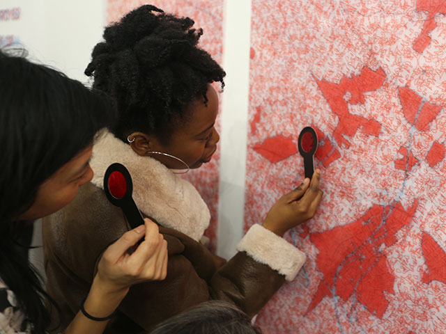
Artificially intelligent systems (AI) are increasingly the ubiquitous, unseen arbiters of our social, civic and family lives. Ever increasing computational power, combined with almost limitless data, has led to a turning point in the way artificial intelligence assists, judges and cares for humans. But in the wake of such power we must ask, what are we making inherently unknowable as the world becomes more predictable, managed, and discrete? And what does it look like to spatialize memories, knowledge, and experiences of urban geographies that lie outside of the algorithm?

“Decoding Space: Liquid Infrastructures,” meditates on redlining, a popular narrative of post-WWII economic segregation and a conceptual framework that is often engaged to explain contemporary patterns of poverty and racial segregation. This keynote engages redlining and subaltern geographies as a critical intervention in reframing race, space, knowledge, and data.
Ron Morrison, University of Southern California, Los Angeles, US
05:30 pm
Closing
close
close
close
close
close
close
close
close
close
close
close
close
close
close
close
close
close
close
close
close
close
close
close
close
close
close
close
close
close
close
close
close
close

Information+

Workshops

The workshops at Information+ [19 Oct] offered a hands-on, conversational, and empowering opportunity to acquire new skills, engage in vibrant discussions, and warm up to the conference.

Amber Thomas & Ilia Blinderman, The Pudding
Making Pudding: An introduction to creating visual, data-driven stories

These days, data is everywhere! Knowing how to tell a compelling story with data is useful, regardless of your occupation. This introductory workshop will teach attendees to tell their own data-driven, visual stories. Amber and Ilia will take the group through The Pudding’s workflow, from coming up with the perfect data-driven idea, to designing charts to communicate it, and putting all the pieces together to create a single, cohesive, narrative-driven story. No previous data or visualization skills necessary.

Katrin Fritsch, London School of Economics and Political Sciences; Helene von Schwichow, Humboldt Institute for Internet and Society
A data walk through Potsdam: Experiencing data in urban space

We will place ourselves in the urban sphere and conduct a collaborative walk through the city of Potsdam. Small groups will collaborate to reflect on the genesis, visualisation, and interpretation of data in urban space. Using a set of ethnographic methods, we will a) discuss data and walking as a form of perceiving urban space, b) go on walks to observe, count, describe, and map the data, and c) critically interpret the findings of all working groups. By doing so, we want to emphasise new forms of knowledge generation and perception, that can challenge current logics of widespread datafication.

Gina Weng & Cesar Jardim, Trifacta
Data preparation in action with Trifacta

Data preparation is a crucial step in data analytics initiatives, but traditional methods can take up to 80% of the time spent. In this workshop, you will learn about data preparation, how it fits into typical data initiatives, and how you can prepare data more efficiently with Trifacta in the cloud. You will participate in several hands-on exercises that include sampling, cleaning, structuring and enriching data. Previous experience working with data is beneficial, but not required.

Marek Tuszynski & Leil Zahra, Tactical Tech
Investigating the investigator, beyond the usual tools

In light of recent restrictions and the backlash against investigators, and in the quantified society in which we live, where data traces are both an asset and a weapon, we will take a closer look at particular investigations that go beyond the commonly-used techniques, especially cases where data is not easily accessible or non-existent. We will use this process to investigate the investigators to learn about the data traces left behind in the investigative process, and where possible, how we can have more control over those traces. The workshop is addressed to citizen investigators, to curious and critical individuals and groups who want to stretch their necks further into what they feel is not right. Those who want to dig deeper in order to hold power to account and/or expose injustices and issues locally or globally. Skills required: Patience, curiosity, sense of humor, and an eagerness to explore. An interest in connecting the dots and drawing stories out of them. Please bring your laptops with you.

Viktoria Brüggemann & Mark-Jan Bludau, Urban Complexity Lab, FH Potsdam
A dive into the depot: Co-designing visualizations of cultural collections

When the collection of the Louvre goes online, Mona Lisa is joined by her not so prominent friends from the depot. Digitization promises unprecedented levels of access to cultural artifacts and exciting opportunities for information visualization. This workshop explores and critically examines interdisciplinary methods for designing visualizations of cultural collections. Drawing from experiences in running workshops with data from various cultural institutions, we will dive right into common problems of this emerging area, moving from abstract questions of representation and interpretation of the inventory to concrete design implementations of collection interfaces. We believe that co-design techniques offer powerful approaches to the creation of novel and meaningful visualizations that are accepted and appreciated by all stakeholders. No previous experience in visualization techniques are necessary, however, an interest in cultural collections will come in handy.

Information+

Exhibition

The exhibition “Image Factories” (Bildfabriken) organized by the German Museum of Books and Writing of the German National Library opened at the University of Applied Sciences Potsdam [19 Oct – 14 Dec] during Information+ 2018.

Image Factories. Infographics 1920–1945
Fritz Kahn, Otto & Marie Neurath, Gerd Arntz

The exhibition focuses on a period of visualization history that was characterized by information overload and growing demands for visual communication in the early 20th century. Two specific responses are highlighted, each paving the way for a newly established genre of infographics.

The teams around the Austrians Otto & Marie Neurath, and the German physician Fritz Kahn, developed their distinctive visual languages almost simultaneously, in both cases based on formal stylization of the human body. The Neuraths’ “Isotype” utilized pictogram-like graphics as counting units for the quantification of social realities. In contrast Kahn’s “Factories of the Human Body” employed sequences of mechanistically interpreted diagrams, in which the human being was depicted as an “Industrial Palace”.

The exhibition includes detailed reproductions and animations from the rich holdings of the German National Library and from American and British archives. The exhibition was developed at the German Museum of Books and Writing together with the Institute of Communication and Media Studies, University of Erfurt.

Visit the Exhibition

Location: FH Potsdam, Hauptgebäude Kiepenheuerallee 5, 14469 Potsdam

Opening hours: 23 Oct - 14 Dec 2018,
Monday - Friday, 11am - 4pm

Opening reception: 19 Oct 2018 at 7pm
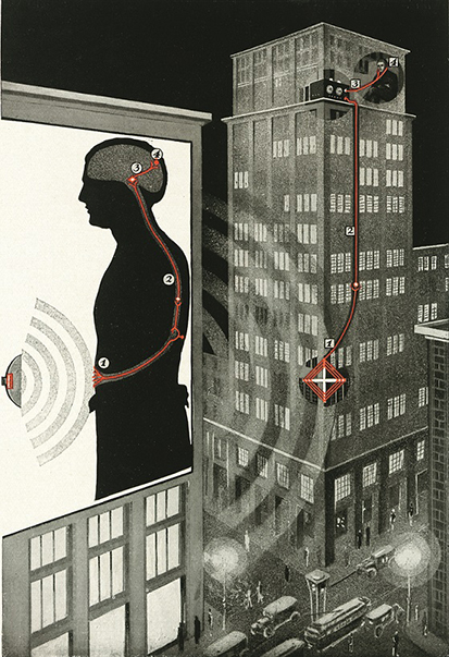
Fritz Kahn: Die Empfindungsbahn, 1929. Image: Kosmos/Debschitz

Information+

Venue

This year’s conference took place at the University of Applied Sciences Potsdam (FH Potsdam), approximately one hour away from Berlin.
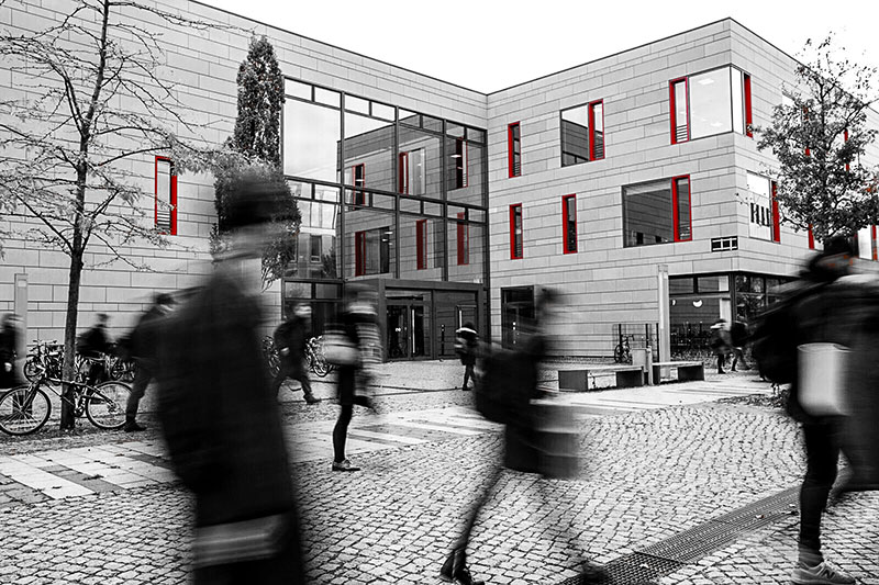
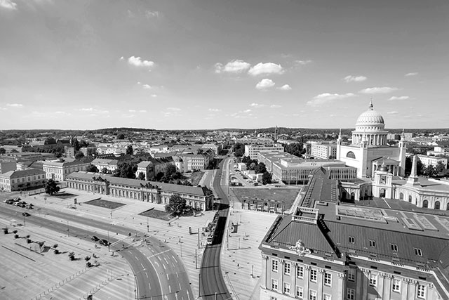
Foto: Benjamin Reissing

Location

The conference will be held at the main building of the University of Applied Sciences Potsdam. With innovative study programs like interface design and urban futures as well as two research labs (Urban Complexity Lab and the Interaction Design Lab), the university provides space for a wide spectrum of visualization research and teaching.

Potsdam is the capital of the federal state of Brandenburg with a history of over 1000 years and is a city of UNESCO World Heritage. A once royal capital, Potsdam is characterized by fifteen palaces including the famous Sanssouci, many parks and lakes and a diverse cultural heritage.
Potsdam is also a center of science, with over 40 scientific institutions operating in the city and has one of the highest ratios of scientists in Germany. Furthermore, the Babelsberg film studios are Europe's biggest cohesive film production complex, having created a broad range of international productions, including awarded movies like The Pianist or The Grand Budapest Hotel.

The university is situated north of the city center. The campus and public transport to the location are wheelchair-accessible. For more information regarding accessibility please contact us via E-mail.

Directions

Campus Fachhochschule
Main Building
Kiepenheuerallee 5
14469 Potsdam
Germany

Open in Google Maps
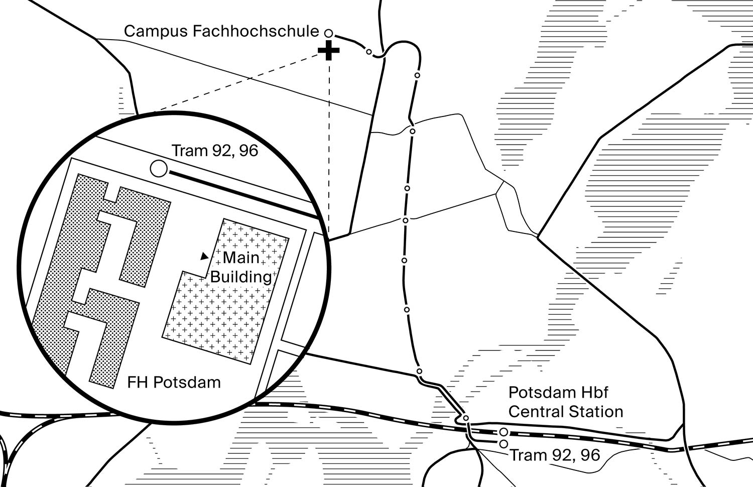
We recommend travel by public transportation. The Berlin ABC ticket allows the use of buses, trams, and trains in Berlin as well as Potsdam.

If you are flying in, coming from Berlin Schönefeld Airport, you can take a regional train (RB22 to S Griebnitzsee Bhf, 50 min) directly to Potsdam Hauptbahnhof (central station). Arriving at Tegel Airport, you can take an airport bus (TXL to S+U Alexanderplatz, 25 min) to Berlin Hauptbahnhof (central station) and go on from there.

If you arrive by train, it is likely you will arrive at Berlin Hauptbahnhof (central station).

From Berlin Hauptbahnhof you can take the S-Bahn (S7 to Potsdam Hbf, 45 min) or a regional train (RE1 to Brandenburg/Magdeburg Hbf or RB21 to Wustermark/Golm Bhf, 25 min) to get to Potsdam Hauptbahnhof.

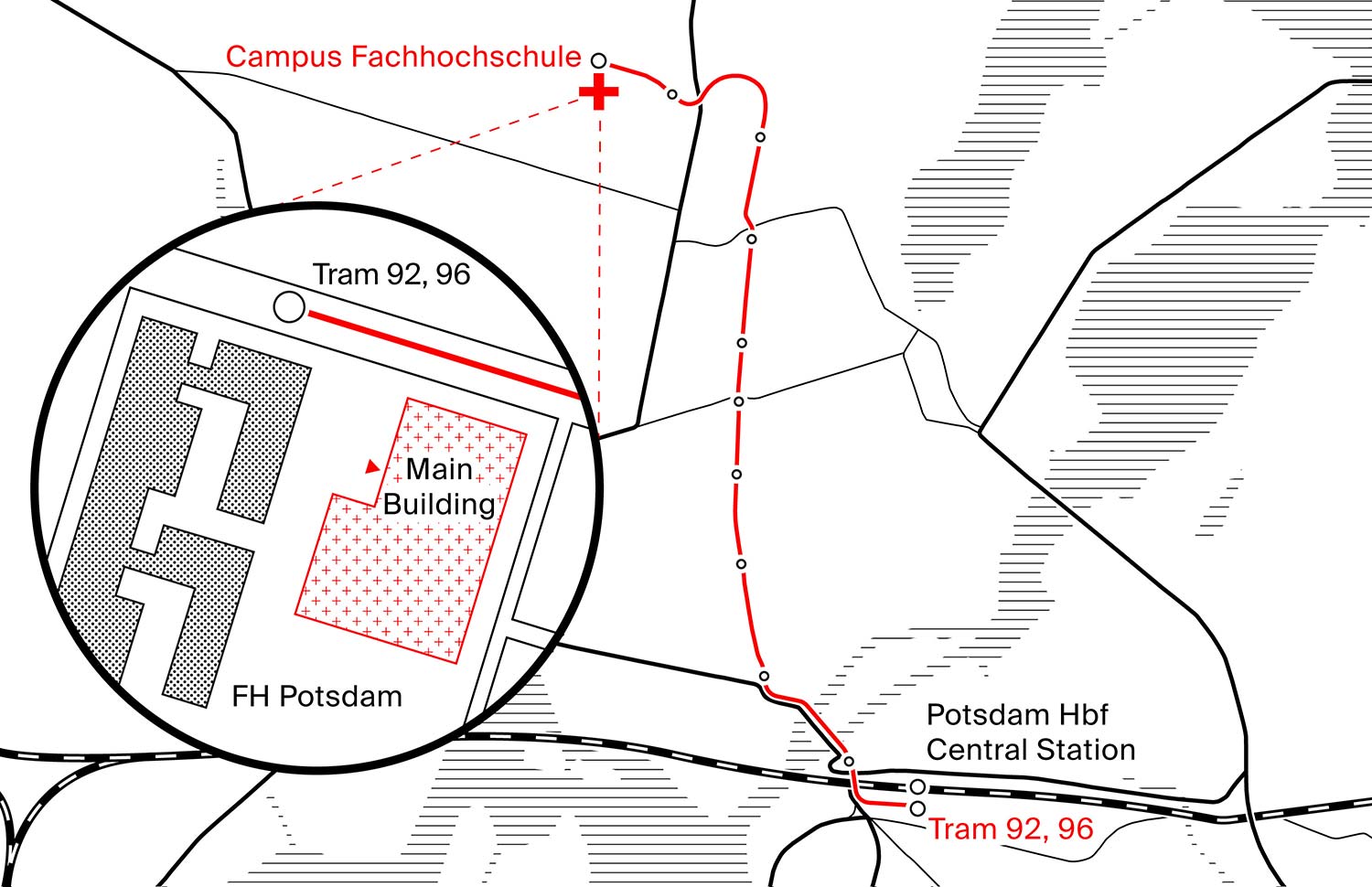
From Potsdam Hauptbahnhof, you can either take tram 92 to Kirschallee or tram 96 to Campus Jungfernsee and get off at Campus Fachhochschule (12 min). Alternatively, you can reach the campus by bike (15 min), which you can rent at the central station.

Where to stay?

Potsdam as well as the nearby Berlin offer a wide variety of places to stay. Hotels near our conference location are:

Jägerallee 20
14469 Potsdam

Gregor-Mendel-Straße 27
14469 Potsdam

Friedrich-Ebert-Str. 88
14467 Potsdam

Information+

diversity scholarship

The Information+ Conference welcomes and encourages participation by people of all backgrounds and identities. We are committed to fostering and sustaining an environment of respect and inclusivity. To increase participation at Information+ by underrepresented or historically marginalized groups, we awarded 10 diversity scholarships. Priority was given to applicants who have their contributions accepted for presentation at the conference.


Information and Process

The Information+ Diversity Scholarship Committee reviewed applications based on a combination of need and impact, and awarded 10 diversity scholarships that include:

Complementary Conference registration.

A maximum of: 500 € per recipient within Europe, and 1,000 € per recipient from other countries. We understand that the funds may not cover all costs, but we do hope the scholarship will help recipients attend the conference. Funds can be used to help support travel, lodging, and childcare. Recipients will need to keep original flight or train tickets, expense receipts, and evidence of payment (i.e. bank statement) up to described limits for reimbursement once the conference is over.

Timeline

10 July Application period closes.
31 July Notifications sent.

Eligibility

Applicants from underrepresented and/or marginalized groups including, but not limited to: gender, identity, race, ethnicity, disabilities, socioeconomic status, discipline.

Financial need in order to be able to attend the conference.

18 years or older.

Diversity Scholarship Committee

Arvind Satyanarayan MIT EECS/CSAIL
Catherine D’ignazio EMERSON COLLEGE
Isabel Meirelles (chair) OCAD UNIVERSITY
Jen Christiansen SCIENTIFIC AMERICAN
Maria Gonzalez De Cossio UNIVERSIDAD AUTÓNOMA METROPOLITANA
Yanni A Loukissas GEORGIA INSTITUTE OF TECHNOLOGY
Yu-Ru Lin UNIVERSITY OF PITTSBURGH

Information+

Important Dates
15 May Submission deadline
02 Jul Notification of acceptance
10 Jul Diversity scholarship deadline
31 Jul Diversity scholarship notifications
20 Aug Registration open
19–21 Oct Workshop & Conference
19 Oct – 14 Dec Exhibition
21–26 Oct IEEE VIS (separate registration)

Information+

About

Information+ 2018 was made possible through the help and support of many people and partnering organizations.

Organizers

Marian Dörk Fachhochschule Potsdam
Isabel Meirelles OCAD University

Website

Fabian Dinklage & Florian Zia BA Interface Design, FH Potsdam

Program Committee

Gregor Aisch Datawrapper
Dominikus Baur do.minik.us
Rahul Bhargava MIT Center for Civic Media
Jeremy Boy United Nations
Matthew Brehmer Microsoft
Nadieh Bremer Visual Cinnamon
Petra Cerne Oven University of Ljubljana
Karen Cheng University of Washington
Jen Christiansen Scientific American
Paolo Ciuccarelli Politecnico di Milano
Nicole Coleman Stanford University
Christopher Collins UOIT
Catherine D’ignazio Emerson College
Patricio Davila OCAD University
Jason Dykes City, University of London
Veronika Egger IIID – Intl. Inst. for Information Design
Priscila Farias FAU-USP
Angus Forbes University of California, Santa Cruz
Jorge Frascara University of Alberta
Manuela Garreton Pontificia Universidad Católica de Chile
Katherine Gillieson ECUAD
Maria Gonzalez de Cossio Universidad Autónoma Metropolitana
Peter Hall University of the Arts London
Uta Hinrichs University of St Andrews
Jessica Hullman University of Washington
Eric Kindel The University of Reading
Andy Kirk Visualising Data
Robert Kosara Tableau
Yu-Ru Lin University of Pittsburgh
Yanni A Loukissas Georgia Institute of Technology
Elijah Meeks Netflix
Miriah Meyer University of Utah
Boris Müller Fachhochschule Potsdam
Scott Murray O'Reilly
Till Nagel Mannheim University of Applied Sciences
Guillermina Noel University of Alberta
Angela Norwood York University
Dietmar Offenhuber Northeastern University
Charles Perin City, University of London
Nathalie Riche Microsoft
Stacie Rohrbach Carnegie Mellon, School of Design
Irene Ros Google
Arvind Satyanarayan MIT EECS/CSAIL
Chad Skelton Kwantlen Polytechnic University
Sarah Slobin Reuters
Carla Spinillo Universidade Federal do Paraná
Moritz Stefaner Truth & Beauty
Michael Stoll Augsburg University of Applied Sciences
Danielle Szafir University of Colorado Boulder
Karel van der Waarde Swinburne University of Technology
Sue Walker The University of Reading
Shirley Wu sxywu.com

Local Team

Carolin Achtermann, Mark-Jan Bludau, Daniel Boubet, Viktoria Brüggemann, Jens Ove Drößiger, Constanze Flamme, Linda Freyberg, Roane Knowles-Rapson, Julia Kontor, Michael Dustin Kummer, Bela Kurek, Inés Lauber, Boris Müller, Jonas Parnow, Nikolas Ripka, William Heiko Schmidt, Fabian Schrader, Hannah Schwan, Stefanie Semm, Fidel Thomet, Gilbert Wigankow, Feline Wigman, Julian Lucas Wohlleber

Years

2016 in Vancouver, Canada

2018 in Potsdam, Germany

2021 online

Contact

For updates, find us on Twitter: @InfoPlusConf
For questions please send us an E-mail